S&P 500, SPX, NASDAQ 100, NDX – OUTLOOK:
- Earnings from the big technology companies may have boosted US equity indices.
- However, the checklist of concerns has lengthened.
- Overall trend remains up for the S&P 500 and the Nasdaq 100 index.
Recommended by Manish Jaradi
How to Trade the “One Glance” Indicator, Ichimoku
Earnings from the big technology companies may have boosted US equity indices but the bar for further gains is rising ahead of the US FOMC meeting next week. That said, the trend remains up and so far, there are no signs of a reversal of the uptrend on technical charts.
The quarterly earnings continue to paint a constructive picture for US companies, with big tech companies beating estimates recently. Moreover, of the roughly 50% of the companies that have reported so far, 66% have reported sales surprise and 80% have reported earnings surprise.
However, concerns about the US banking sector have resurfaced after First Republic’s shares plunged on the larger-than-expected drop in deposits. While the overall contagion effect could be significantly contained than in the previous episode in March, the checklist to prevent meaningful gains has increased. The debt ceiling issue is clearly a source of volatility – the US 1-year CDS hit the highest level at least since 2014.
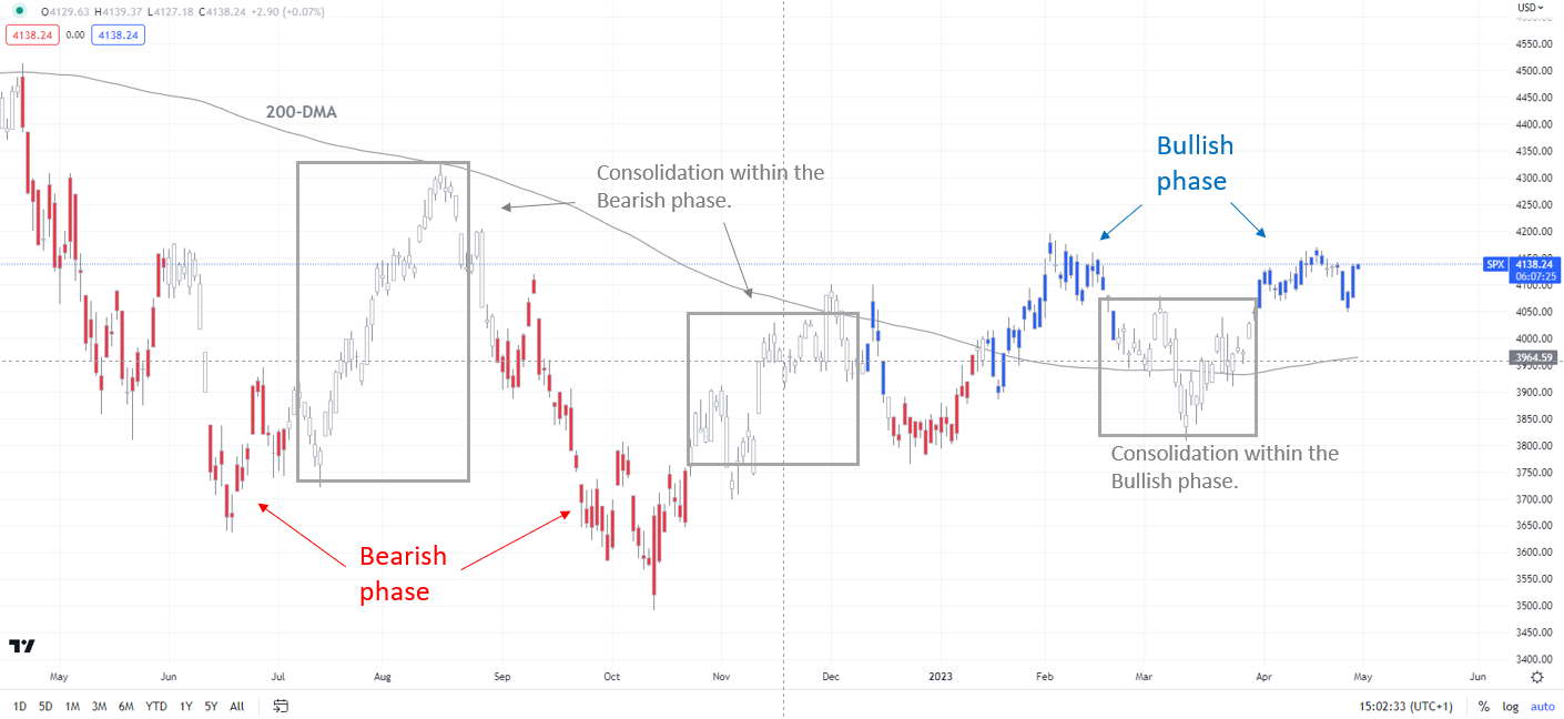
S&P 500 Daily Chart
Chart Created by Manish Jaradi Using Tradingview
Note: In the above colour-coded chart, Blue candles represent a Bullish phase. Red candles represent a Bearish phase. Grey candles serve as Consolidation phases (within a Bullish or a Bearish phase), but sometimes they tend to form at the end of a trend. Note: Candle colors are not predictive – they merely state what the current trend is. Indeed, the candle color can change in the next bar. False patterns can occur around the 200-period moving average, or around a support/resistance and/or in sideways/choppy market. The author does not guarantee the accuracy of the information. Past performance is not indicative of future performance. Users of the information do so at their own risk.
Furthermore, the Fed inflation battle is far from over as price pressures aren’t cooling fast enough to justify the market’s pricing of around 50bps of easing by the year’s end. Tighter financial conditions and credit tightening because of the banking stress is likely to result in slower growth, but it remains unclear if the Fed will choose to support growth while inflation is well above its 2% target, raising the risk of a recession. According to Bloomberg’s median consensus, there is a 65% chance of a US recession in the next 12 months.
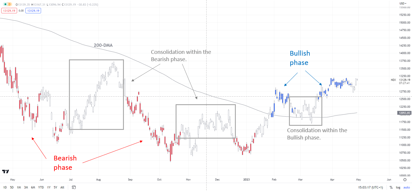
Nasdaq 100 Daily Chart
Chart Created by Manish Jaradi Using Tradingview
Note: In the above colour-coded chart, Blue candles represent a Bullish phase. Red candles represent a Bearish phase. Grey candles serve as Consolidation phases (within a Bullish or a Bearish phase), but sometimes they tend to form at the end of a trend. Note: Candle colors are not predictive – they merely state what the current trend is. Indeed, the candle color can change in the next bar. False patterns can occur around the 200-period moving average, or around a support/resistance and/or in sideways/choppy market. The author does not guarantee the accuracy of the information. Past performance is not indicative of future performance. Users of the information do so at their own risk.
From a technical standpoint, both indices remain in a bullish phase, further reaffirmed by the higher-top-higher-bottom sequence — first highlighted in January (see “S&P 500 and Nasdaq 100 Index Technical Outlook: Turning Bullish”, published January 28. Furthermore, the retreat in February-March was a consolidation within the bullish phase and not a reversal of the uptrend. See “S&P 500 and Nasdaq Outlook: Is Powell’s Testimony a Game Changer?”, published March 9.
However, weak market breadth coupled with indices around year-to-date highs implies the leadership is concentrated in a few stocks, rather than broader participation. For instance, only 32% of the members are above their respective 200-day moving averages (DMAs) in the Nasdaq Composite index, while 53% of the members are above their respective 200-DMAs in the S&P 500 index.
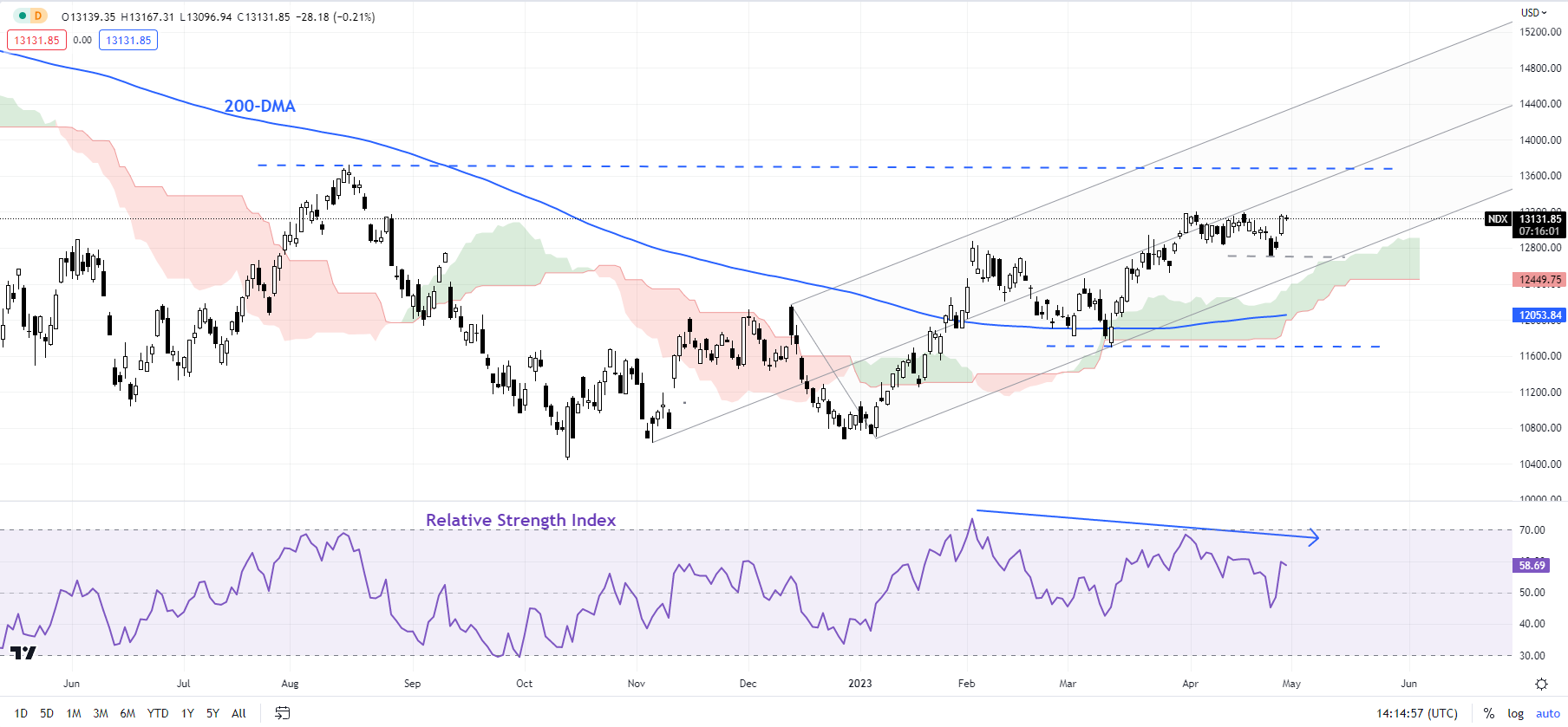
Nasdaq 100 Daily Chart
Chart Created by Manish Jaradi Using Tradingview
Nasdaq 100: Could give a shot at the August high
As long as the index remains above immediate support at the April 25 low of 12725, the short-term upward pressure is likely to remain intact. For a reversal of the uptrend, the index would need to break below the 200-period moving average on the 240-minute charts (withstood the downward correction in March), now at about 12100.While 12725 support is in place, the index could retest the August high of 13720.
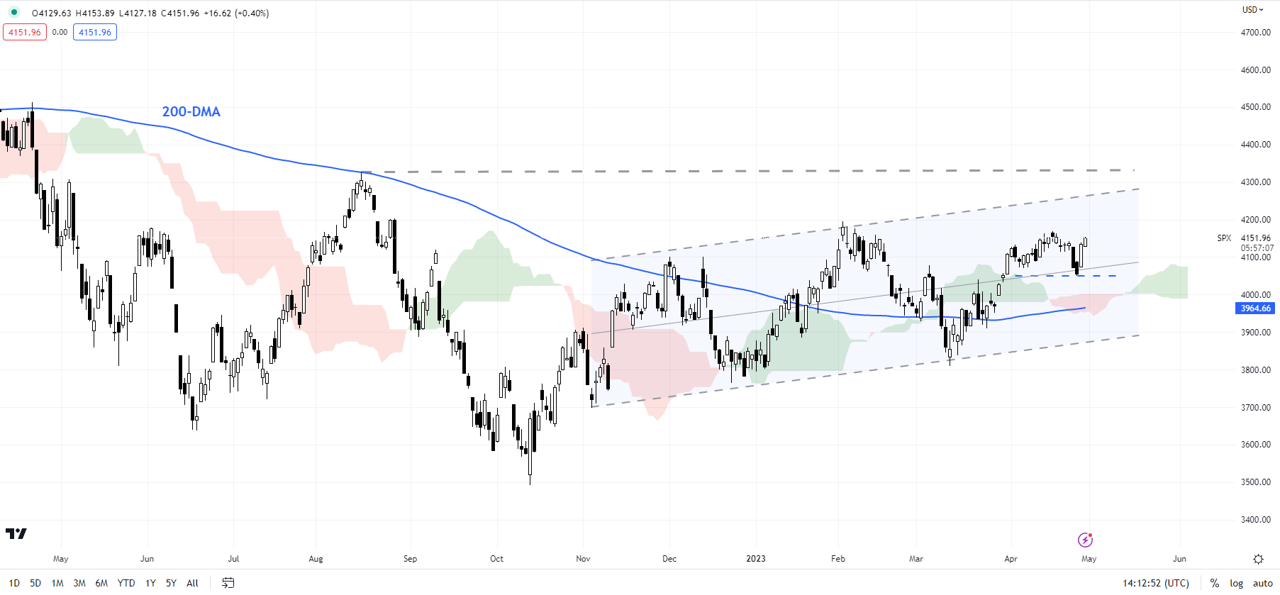
S&P 500 Daily Chart
Chart Created by Manish Jaradi Using Tradingview
S&P 500: Still guided by the uptrend channel
The S&P 500 index’s failure this month to cross above the February high of 4195 provides some reason for caution in the near term. However, there is quite strong support for the index on the lower edge of the Ichimoku cloud channel on the daily chart at about 3960. A break below the support would suggest that the upward pressure had faded somewhat. Only a break below the March low of 3809 would disrupt the higher-top-higher-bottom sequence from the end of 2022. The broader bias remains for a retest of the August high of 4325.
Trade Smarter – Sign up for the DailyFX Newsletter
Receive timely and compelling market commentary from the DailyFX team
Subscribe to Newsletter
— Written by Manish Jaradi, Strategist for DailyFX.com
— Contact and follow Jaradi on Twitter: @JaradiManish


